Honestly, making a site responsive is nothing new, not even for me. Nevertheless, I wanted to document the process (no surprise there). Since as of the date of publishing this post, the responsive version of the theme hasn’t gone live yet, you get a sneak peek.
I was a little worried because we have a Drupal site and I’d never worked on a Drupal theme before. I also didn’t have a Drupal build. Would you believe I did the inane thing of tweaking all the CSS through the browser?
An Aside: Developing via the Browser
Developing inside of a browser is much easier than it used to be thanks to Chrome’s workspaces. You can load your own files even into the set of files being loaded by an existing website. Since I was mostly editing the CSS, I simply had my own CSS file that overwrote existing rules. (I later ported those rules into their proper places in the theme files.)
The Existing Theme
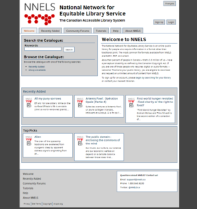
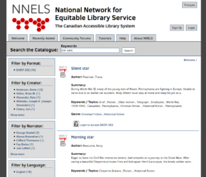
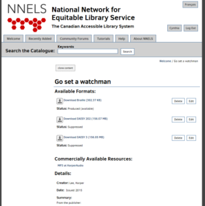
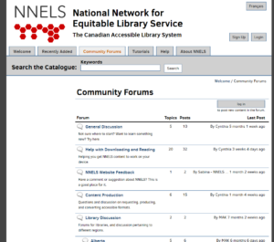
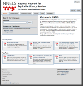
First, have some screenshots of the existing theme:
Obviously, the major issue is that the theme is not responsive. The page content is fixed at 1000px, but there were some other issues we wanted to resolve based on feedback we received:
- simpler front page visually,
- higher contrast when using a background colour,
- larger font size,
- wider page content size,
- and some other minor spacing issues.
The Process
Honestly, there isn’t a huge amount to tell. The key parts were:
- media queries (For The Win!),
- changing most of the font-size, padding, margin, and other pixel-specified numbers to relative numbers (namely rem),
- adding a menu button (for when the main menu is hidden), and
- changing the header so that it’s a regular image (instead of a background image).
The media query break points were decided by the “when it looks stupid” guideline. Some of it was a bit approximate because the site is bilingual and built to be multi-lingual, but was admittedly catered to the English version first, then tested with the French version.
Break points:
- 56.7rem (900px) for header/front page
- 51.25rem (820px) for header/menu
- 45.675rem (725px) for header/front page
- 37.8rem (600px) for header/forum
- 34rem (540px) for header/search/footer
- 24rem (385px) for repo-item download icons
As you can tell, the break points mostly apply to the header (making it more compact, smaller font, eventually removing the logo). The only one not really mentioned is moving sidebar content below the main content, essentially going from a two column layout to a single column. Much of the front page specific code does something similar to collapse the 2-column and 3-column layout to a 1-column layout.
Responsive Site: Yay~
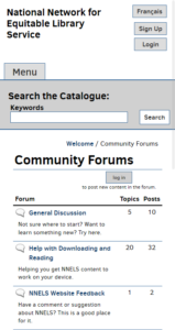
Have some screenshots of the new, responsive version of the theme:
You can see the progression of the header as the viewport gets smaller, and quickly see the nav menu and column layout change. Almost all the other elements on a page are left to its own devices. I do take out a column from the forums view at a small size.
The site is designed to work at 380px and higher, though in practice I believe it works at 320px and higher.
Take Away
My one take away from all this? You generally only need minimal knowledge of the CMS to go from a non-responsive theme to a responsive one.
It may not even take a long time. It took me less than a week’s worth of hours (though results may vary depending on how the original was structured, but I’m not a daily-web-developer-person either). It’s not super pretty, but it works.
Basically, it doesn’t matter if you’re a non-profit or public organization, there is no longer an excuse not to have a responsive or mobile-friendly site.
