I’m away this week, but felt the need to quickly post about the Access Conference. Last year, I requested the organizing committee to do something for students. In the end, they did two things: add student pricing, and allow volunteers to attend the number of hours they volunteer.
I’m happy to report that this year’s Access also has student pricing with no increase in price!
So inspired by the ASIS&T Cool Tool Day, I thought it’d be neat to do one of these since there weren’t many volunteers to do lightning talks/presentations at the code4lib Toronto meetup this time around. Our attendance was a little… paltry, but we had some great presentations! Here are my notes from the session.
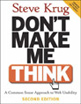
I really appreciate a number of things, many of which are in other reviews and even in his introduction. Nevertheless, for the benefit of my readers, here’s what I like.
It’s short.
It’s easy to understand.
It’s concise and boils it down to a few simple guidelines.
There’s humour in it.
I will say that while most of the ideas and concepts still hold, there are some ideas presented that I think may be a little outdated. It could be that as someone who works with websites on a daily basis that some things seem obvious to me, but may not be “common” knowledge to others. Still, I think it’s easy enough to skip some sections if you feel you already know about it (as I did), and while some parts could be updated, the guidelines and concepts still hold true.
My Notes
I decided to take some notes for myself since I borrowed the book. If these notes pique your interest in any way, I suggest reading the book, because my notes are just that, notes, and in no way do the book justice.
Rule 1: Don’t Make Me Think
This translates to Eliminating Question Marks.
For example, When searching: What is a keyword? If you say it searches all or everything, then that’s what it should do.
Users should know without thinking:
Location within the site
What’s important
Where things are
Where to go
Why labelled that way
You can’t make everything self-evident, but you can make it self-explanatory.
People Scan and Click the First Reasonable Option
I don’t think this a surprise to people anymore, but it still holds true. The suggestion is to cut your text in half and then half again. Omit any unnecessary words.
Happy talk must die.
Cut down instructions as much as possible; make it self-explanatory instead.
The benefits:
Reduces noise
Useful content more prominent
Shorter pages
Design Pages for Scanning
create a visual hierarchy
take advantage of conventions
break pages into clearly defined areas
make the clickable obvious
minimize noise
People Like Mindless Choices
User should have confidence that they are on the right track. There’s still a limit to the number of clicks a used is willing to go through, but no hard number if they are mindless and not repetitive. Good example is buying for home office and needing to choose home or office.
Navigation
Should be persistent and consistent with the possible exception of the home and forms.
Links should match the page title. This may seem very obvious, but I see this discrepancy quite often.
On any page, you should be able to identify these basic elements:
Site
Page name
Major sections of the site
Local nav
Location within the site
How to search
Home Page
Should be able to answer these questions at a glance:
What site is this?
What do they have?
What can I do here?
Why should I be here and not somewhere else?
Where do I start?
Test Early and Test Often
Not the same as focus groups, which are good for determining the audience, if ideas and wording make sense, and their feelings.
[Usability tests are] for learning whether your site works and how to improve it.
Ideally, one morning a month for testing and then debrief over lunch.
So as part of the website redesign and working on making the site WCAG compliant, I wrote a couple sets of guidelines. One of them was on writing content for the web. Some of the points and the example I got from a coworkers, but most of it I just consider sensible advice. Overall, I tried to keep it fairly short and simple in the hopes that staff members will actually read it!
Writing for the Web
Web readers skim pages and look for keywords, links, and other information that will help them find what they’re looking for quickly. Therefore, when writing new or revising content:
1. Be Clear and Concise
Make your page title descriptive and concise, keeping it fairly short.
Keep sentences, paragraphs, lists, and other information short and simple.
Use lists wherever appropriate, especially when users have choices. Use numbered lists for complex instructions and include important screenshots.
Unless you’re creating a policy page, keep the entire page short (e.g. 2-3 screens worth).
Bad Example:
To find information on citation styles, go to the Library’s Home Page, click on Research Help, then click on Citations and Style Guides and choose APA Style Page, MLA Style page or RefWorks.
Better Example:
For more information about citation styles, check the
APA Style Page
MLA Style Page or
RefWorks
2. Speak to Your Audience
Avoid acronyms and “library” vocabulary when writing content for the library’s webpages.
Write at a Grade 7-8 level in a direct voice, using “you”. For example, use “get” not “obtain”.
Because users scan pages and don’t read them, information needs to be written clearly and concisely and at a reading level that doesn’t impede typical user behaviour.
3. Be Meaningful
Links, in particular, should be meaningful. The words of a link should tell your reader what the link is about.
Screen readers have the option of listing all of the links on a page, so think about whether a user would know what your links refer to out of context.
In addition, don’t overuse links. Only use them where it makes sense, such as for a list of resources.
While moving our website into WordPress, I came across a blog post about adding some personality into a website (I’ve unfortunately lost the link to it). So, I thought I’d find some small ways to do that with our site too.
I was recently reading as well about how successful GVSU Library has been with their construction updates using a twitter account by giving the building a persona.
404 Page
One of the most common ways that a site will show some personality is with its 404 page. One of my favourites is the Github 404. I thought maybe we could do something a little more amusing than the standard 404, so with the help of my partner, we came up with this:
Unfortunately, I got various complaints that the 404 page was confusing and didn’t make any sense (from staff, it was changed before the site went public). I knew from the beginning that it wouldn’t fly with making it public for our users because they wouldn’t get it, but I thought at least one staff member would get the joke.
I may have another stab at it with a simpler one, perhaps with just a headline, but that won’t be in at least a couple of months.
Custom Avatar
One of my thoughts for the blog was to have a custom default avatar that would be a picture of our university mascot or just a version of our library’s logo. Unfortunately, I couldn’t find a plugin that worked on multisite that would allow me to set a custom avatar only for the main site (and not all the subsites).
Placeholder Text
I actually mentioned this in a previous post that I decided to have a little fun with placeholder text, but here it is again.
Eggy the Ram is the name of our university mascot. No one has actually noticed this since our blog hasn’t been moved. Thankfully, unlike the 404, the placeholder text here should have no chance of confusing people.
Badges
Another idea I recently thought of that might be fun is for students to get badges during orientation or even throughout their time in school for completing workshops or similar things. Instead of an in-house system, it could be done using something like Open Badges.
I’d be interested to see if other more formal institutions have done any of these or other things to add some ‘personality’ to their sites.