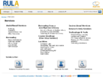
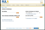
While the Contact page is one of the most visited pages, I had put it off for a time, wanting to redesign the pages that really needed work first. While not the best, the Contact page was functional and was easy enough to skim. After redoing the other pages though, the Contact page started to look ugly in comparison. Continue reading “Revised Contact Us: Making it Simpler and Shorter”
Tag: mockups
Services Redesign & Content Overhaul
Not too long ago, I posted about the revised IA of the Services section of the website. Staff consultations followed particularly to apprise them of recommended changes and to take the opportunity to revise the content. I created mockups, which I got feedback on. Finally, the page went live.
Consultation is Key
Based on the revised IA, I began an extensive consultation process with all the teams involved. While the methods differed, the most common process was by meeting with the librarian in charge, who would discuss the changes with the team and then assign a technician to help with the content revision. At other times, I just asked the librarian if they would have a problem with someone else revising the page.
I focused on the fact that the recommended changes were based on exercises with both staff and students. While the content could stay more or less the same, it was also a good opportunity for the team to make revisions. (Some pages hadn’t been revised in 10 years.)
For the most part, the major changes were discussed with the librarians and the assigned technician took care of the detailed content revision. I also did all the revisions for the technology area, since that’s under our team’s purview. Librarians that didn’t have a technician to help, I assigned the pages to the technician who does web editing support or the co-op student (who also helped with pages that have no owners).
The Old Services
The Services section was comprised of 125 pages, and the landing page looked like this:

Pretty awful, isn’t it? The old IA was a bit of a mess as well, and a lot of pages had the same information or just a single paragraph. The organization seems to have come about via the “we should make a page about this, and put it here”, meaning there doesn’t seem to have been a strict management of content. Not sure duplication of content was reviewed in any way either.
From the card sort, it’s obvious that some of the pages are definitely not where users might typically look for them. Here’s the list of pages in the old IA:
[code collapse=”true” gutter=”false” title=”Old Services IA”]
Services
Audio-Visual Resources & Services
Searching for Audio-Visual Material
Bookings
Borrowing Audio Visual Material
AV Copyright
DVD Player Lending
Digitized AV Resources
Equipment
Screening Facility
Search Other AV Collections
Other Audio Visual Resources
Borrow from Another Library
Search Other Libraries
NRC-CISTI Discover
Borrow in Person from Other Libraries
RACER (Interlibrary Loan)
Using RACER
RACER FAQ
Tips for Faster Interlibrary Loans
Policies
Ryerson’s Lending Policies for External Institutions
Article Not Available @ Ryerson
Request this Title via Interlibrary Loan
Borrower Services
Circulation Records Privacy
Courtesy Notices
Direct Borrowing
Extended Loans
Fines & Penalties
Holds
Library Cards
Alumni & Retirees
Application Forms
Distance Education Library Cards
Faculty & Staff Library Cards
George Brown Library Cards
Nursing Library Cards
Others
Student Library Cards
Loan Periods
Lost Library Materials
Maximum Items Borrowed
Recalling Library Materials
Renewing Materials
Returning Library Material
Self Services
Special Loans
Course Readings (One-stop Service) – no changes to subpages
Facilities & Technology
Access from Home
Change Machines
Computer Labs
Lost and Found
Photocopying
Printing
Study Space
Telephones
Washrooms
Wireless Access (wifi)
Instructional Services
Laptop Loan Program
Laptop Loan FAQ
Ronald D. Besse Information & Learning Commons
About the Commons/FAQ
Besse Commons Hours
Codes of Conduct
Floorplan
Mission
Photo Gallery
Ronald D. Besse
Software
Vision
Geospatial, Map and Data Centre
Instructional Services
Learning Commons Lab (ILC)
Research Help Services
Technology Support
Writing Centre
Services for Distance Education Students
Services for Faculty
Audio Visual Services
Direct Borrowing
Electronic Resources
Faculty Borrowing
Library Cards
Ordering
Orientation Classes
Reference Services
Targeting Journals for Publication
Instructions for Authors
Journal Impact Factors
Periodical Directories
Periodical Title Abbreviations
Recent Publications
Refereed Journals
Services for Graduate Students
Borrowing & Renewing
Computers & Study Space
Direct Borrowing
Graduate Workshops
Reference Services – Graduates
Thesis Submission
Services for Persons with Disabilities – no changes to subpages
[/code]
Content Revision & The Authoritative Copy
Other than merging a bunch of pages and getting rid of redundant ones, I consolidated a lot of information where we needed one “authoritative” copy: hours, policies, and fines. It is particularly important that we do not have conflicting information for circulation staff, because they are the ones that deal with fines, and lost and damaged items. Obviously, this also prevents confusion and possible frustration on the part of our users. A short guideline now exists on our intranet in regards to this issue.
We also moved our existing FAQ pages to LibAnswers, our FAQ database.
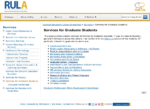
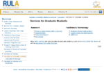
A couple of the ‘Services for…’ pages don’t really belong to anyone and they suffered from some of the same problems as the old Services page. I got our co-op student to look them over and suggest changes. Here’s what we came up with for the Graduates page:
We decided to take out redundant links, and links that were not of special interest. Then, obviously, we decided to categorize them a little so it was easier to read.
Mockups
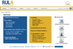
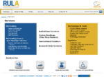
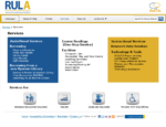
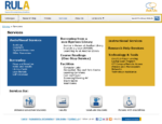
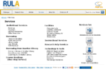
As per usual, I created a number of mockups for the web committee to review. In an attempt to make it look a little more consistent with Research Help, I used the coloured boxes motif and played around with different ways of organizing the pages.
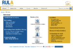
People were actually very against the boxes, and I agreed that it seemed like trying to force the look on Services. Based on the feedback on which they did prefer, I created clean black and white versions of two of the original mockups.
The group preferred mockup #1 with the icons on the right hand side. After a couple of more changes based on the committee’s feedback, I posted it in the staff room and sent it out by email as well. Sadly, I didn’t get any feedback though I suppose that’s not necessarily bad.
Services Revised
After all the consultations and content revisions, we pared Services to 90 pages (vs. 125). This is the final version of the IA:
[code collapse=”true” gutter=”false” title=”New Services IA”]
Services
Audio-Visual Resources & Services
Searching for Audio-Visual Material
Booking AV Material
Borrowing AV Material
Digitized AV Resources
Other AV Resources
Borrower Services
Fines & Penalties
Holds and Recalling Materials
Library Cards
Alumni & Retirees
Application Forms
Distance Education Library Cards
Faculty & Staff Library Cards
George Brown Library Cards
Nursing Library Cards
Others
Student Library Cards
Loan Periods
Lost Library Materials
Returning Library Material
Self Services
Borrow from Another Library
Direct Borrowing
Search Other Libraries
RACER (Interlibrary Loan)
Using RACER
Tips for Faster Interlibrary Loans
Request this Title via Interlibrary Loan
Course Readings (One-stop Service)- no changes to subpages
Facilities & Spaces
Computer Labs
Software
Lost and Found
Ronald D. Besse Information & Learning Commons
About the Commons
Codes of Conduct
Mission & Vision
Photo Gallery
Ronald D. Besse
Geospatial, Map and Data Centre
Learning Commons Lab (ILC)
Writing Centre
Study Space
Telephones
Washrooms
Viewing AV
Instructional Services
Research Help Services
Technology & Tools
Access from Home
Change Machines
DVD Player Loan
Laptop Loan Program
Photocopying
Printing
RefWorks
Technology Assistance
Wireless Access (WiFi)
Services for Distance Education Students
Services for Faculty
Scholarly Communication
Journal Impact Factors
Open Access Author Fund
Refereed Journals
Services for Graduate Students
Graduate Workshops
Services for Persons with Disabilities – no changes to subpages
[/code]
The ILL pages haven’t actually been revised yet as they were busy with their projects, but that should happen in the next little while. The page count and the new IA are based on an already revised section of ILL, so that may differ from what actually happens in the future.
I also ended up writing a fairly long email to list all the changes as requested that I sent out to all staff.
The final version turned out fairly well I think.

About Us Redesign & Reorganization
The website redesign continues! Next up is the ‘About Us’ section. I find it more difficult to do sometimes, because our users don’t use the About section nearly as much, so don’t always have much of an opinion about it. Although it goes against my usual inclination, I decided to go ahead with only minimal feedback. Continue reading “About Us Redesign & Reorganization”
Redesigning the Digital Commons Page
Recently, our team has been assisting with a new initiative to make sure documents sent in to our institutional repository (IR) are accessible. I won’t go into much detail, but since this new initiative was being launched, it was proposed to have the digital commons (our IR) page redesigned for the launch.
Old Page
The old page was really just a lot of text, and too much of it. I’m also not sure how long it had been since anyone had revised it. The biggest problem was that it was difficult to find what you wanted, especially how or where to submit a document.

Mockups
So the first mockup was actually given to me by the group working on the IR project. While a vast improvement over the original page, I was not a fan of the quadrant look. I’m probably biased because it was overused at my last work place, but regardless, I thought I could do better.

One thing that didn’t make sense to me was why you would have a link to a search page instead of just building in a search on the page (same with the news). While a search box was thought of, I’m not sure how it would’ve worked into the square design. I was actually working on the Articles redesign around the same time, so I ended up using some of the ideas I had floating around in my head already.

The colours I used were based on the first mockup, which were in turn based on the IR site’s colours.
Redesigned Page
The redesigned page came out pretty much exactly as the mockup. However, the project members called me the day after to tell me that the green shows as a very ugly yellow if the screen or projector is not properly calibrated. So, I ended up changing the colours to our library’s colours.

Most of the text that was on the original page is now on the About page linked from this landing page. I think it’s a huge improvement, so hopefully it helps to encourage more of our users to submit things to our IR.
Revised Articles Section & New Landing Page: Using a Card Sort to Clean Up
As part of the ongoing effort to improve the website, I have been redesigning the website one section at a time. Earlier in the term, I did the Research Help section. In the last couple of weeks (that’s right, only about 2-3 weeks!), I worked on getting the ‘Articles’ section cleaned up with a new landing page.

Card Sort to Clean Up
 I knew that I wouldn’t have time to do a proper card sort study, but I decided to do a card sort with the web committee. We have enough people that I divided the committee up into two groups and gave them sticky notes with the names of the existing pages.
The sticky notes consistent all the local navigation links from the left side of the existing page and the second level links you see in the expanded part of the ‘More’ menu here (right). Then, I gave the usual instructions for a silent open card sort (no talking, group as you see fit).
While the purpose of a card sort is not to help clean up a section, it really got staff to see what fit in the Articles section and what didn’t. A lot of the pages were also deemed no longer relevant.
As a group, we made decisions on what to remove, and what to move and where. Quite a lot of the content was moved to either our subject research guides or our FAQ system.
There were one or two pages that we couldn’t decide what to do with, so for the time being they’ve been left where they are for now (e.g. RefWorks page is still in the ‘Articles’ menu though not linked on the landing page).
Mockups
With the pages that were left, I created a few mockups.
The web committee met again to discuss the mockups. I already had my heart set on either #2 or #3, because the whole idea is that it’s simple and clear. Having only one search bar with just a few links give users focus on what they’re looking for. Different people had different preferences on mockups, but with some discussion, the group settled on mockup #3 with a few revisions.
Staff Feedback
As with the research help page, I posted the revised Articles mockup in the staff room to give everyone a chance to provide feedback. This time, I didn’t get any feedback that resulted in any changes, so the final page is the same as the revised version.
New Page
Even though I’m on vacation, I wanted to get the new page up before the next term, so the new ‘Articles’ landing page went up this week.
