Code4lib Day 1: Kill the Search Button II – The Handheld Devices are Coming

by Michael Poltorak Nielsen, Statsbiblioteket/State and University Library, Aarhus, Denmark

Current Mobile Interaction Paradigm

You do a lot with your hands, everyday. Our hands are a really good tool, but currently, the handheld interaction is based on glass. That is you do functions by sliding your fingers, which means there is no feedback on what it does, i.e. it’s not intuitive.

Take a look at Pictures Under Glass: Transitional Paradigm dictated by technology, not human capabilities by Bret Victor.

An Alternative

  • direct manipulation
  • gesture driven
  • palpable
  • tactile

Smartphone Gestures

The near future may mean combining something like the Wiimote and the iPhone.

Mobile Projects

The idea was to build an HTML5 app that searches library data, favourites, view own items, renew, and request. Currently in beta, but to be published soon.

The search app can be augmented with gestures, gestures combined with multi-touch interactions.

Possible interactions with focus on

  • keyboard – typing
  • microphone speech
  • screen – touch, visuals
  • camera – pattern, movement
  • accelerometer – acceleration
  • gyroscope – rotation
  • compass  – direction
  • GPS – movement, position

Gestures

Might include simple ones using accelerometer data, including

  • tilt
  • flip
  • turn
  • rotate
  • shake
  • throw

The problem is that gestures are only really supported by Firefox, and partially supported by Chrome. Thus, it was decided that development would move to the native iPhone app environment with gestures, and HTML5 web app without gestures (but possibly later when supported). Features that are implemented include:

  • Restart search – face down
  • Scroll – tilt up and down
  • Switch views – tilt
  • Request items – touch and tilt left
  • Favourites – touch and tilt right

Check out the demo:

Challenges

  • no standard mobile gestures
  • gesture maybe individual
  • gesture may not be appropriate at all
  • sophisticated gestures are hard to code
  • Objective-C

Augmented Library – Access 2011 Hackfest

So today at Access 2011, it’s hackfest, with ~60-70 people, quite big!

I decided to work on the augmented library topic with 5 others. We discussed two different software products out there at the moment and possible implimentations.

Layar

Layar allows for mobile app development using GPS/Geolocation to provide more information and image recognition to make things/the environment more interactive. Layar is available on the Apple app store and Android.

Advantages: Drupal module, centralized database to search for all layars

Disadvantage: not available on iPod Touch (presumably not on iPad either).

Argon

Developed by Georgia Tech, Argon allows mobile app development using KML for more information based on GPS/Geolocation.

Advantages

  • open source
  • works on iPod Touch

Disadvantages

  • in development (can be buggy)
  • non-centralized (need exact link)
  • only available on iOS products (Android in development, but no timeline)

Possible Implementations

  • shelf/branch location of item
  • scan book covers to bring up book info, reviews/ratings, etc. – would work better in public library setting
  • polls
  • locate subject area, maps displaying subject areas
  • reference/info desk locator
  • interactive pop up e.g. what user wants to do, scan room number for booking system

Demos

Some Thoughts

I think the ideal would really be to create a mobile app that helps the user do just about everything. Wayfinding, searching, find general information (such as hours), find item information (including reviews/ratings), find availability to computers, etc.

What was interesting about the discussions we had was talking about how best might it be implemented with the technology that we have today. Apparently, the University of Illinois developed an app that tells users where to find an item on the shelf using signal strength positioning, but we could imagine it going very wrong especially around a lot of metal shelving. Would it be better to not have it at all than to direct a user to the wrong place? I imagine many would say yes.

Obviously, there are pros and cons to every method, but I think I concluded that if you were to develop a mobile app with the technology we currently have without spending an enormous amount of time on it, the app would work better with image recognition (something a la layar vision or QR codes) combined with input from the user.

For example, if a user wanted to find books on a particular subject, an app would ask what subject the user would like to find, then use GPS to direct them to the branch (for multi-branch campuses) if applicable, then once in the branch, it would pop up a mini-map for the user directing them to that particular subject on the shelf. If at any time they get lost, they just need to scan the appropriate image and the app could come up with a new mini-map providing a path from their current position to the shelf with the subject they’re looking for.

The advantages of a dynamic path map versus real-time positioning is that positioning technology is still not very accurate, and most users will not give apps more than one or two chances before deciding whether it’s useful or not.

Hopefully we can get the layar one public and then rather than simply showing a short video, we can have people try the app themselves.

Link: Googledoc Notes, screenshots, and code

About Portal

So the About portal really was just a redesign for the most part. The process was the usual inventory of pages of the current About section (see below left), trying to put them into cateogries, then coming up with a preliminary information architecture. For this portal, we also consulted with the Communications department to ask about what else might be added.

Attempt #1
The first attempt at the redesign was to use the existing design from the Help and Services portals (see above right). If you look at the full version, you can tell that the problem with using the existing design is that there is a lot of white space since each category only has 2-4 links. Everyone, who looked at this first attempt, agreed that it just didn’t work. We concluded though that since the About portal didn’t serve the same sort of purpose as Help, Services, and Find, it would be okay to use a different design. So, it was back to the drawing board.

Attempt #2
When thinking about how we might do another design, one of the ideas was to somehow bring the University Librarian’s message back to the foreground. We essentially ended up with the layout of the old design, just with the set of links organized in the new way. This didn’t work either since the navigation of the portal was essentially lost.

Attempt #3
Finally, I thought perhaps we could go with a simpler design. I looked at a bunch of other sites (library and otherwise) to see how they dealt with the layout and organization of their About sections. Based on those layouts and suggestions from others, we came up with the current design.

screenshot of current about
New About

The new About design uses the same organization as in the first version, but simply lays out all the links underneath a heading. It also has the first two paragraphs of the university librarian’s message, where if you click on the title, you will see the full message. We agreed that this was a nice balance between the first and second attempts.

Contact Us page
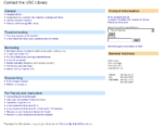
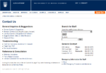
Most pages/posts were simply moved over, but all were in agreement that the Contact Us page needed a redesign. So, a redesign it was. We felt that the old page had too many links (all users who saw this page during the usability test said as much), especially since a lot of these links exist elsewhere on the site (namely on the Services Portal) and the front page as well in many cases. A couple of the forms were merged or updated to par down the number of links further.

Status
Migration of all the pages have been done and everything has been setup, but since the Newsletters were moved into Issuu, issues were embedded to posts (which worked fine), but then didn’t show up on aggregated pages (the embedded object would just be stripped out). Styling has yet to be done as well. Hopefully it’ll be live soon though.

Card Sort Reflections & Analysis

In July, I had done a card sort study for the section of the website I was helping to redesign.  Particularly since the new portal I’ve been working on doesn’t have as clear cut categories, we decided to do another card sort.

Reflections
Just a Few Number of Sessions worked fine.  The first time we did the study, we did 5 group sessions and found that we began finding the same results, especially after refining it the first time.  We only did 4 group sessions this time and we still found after the 3rd session, we found nothing new (though that may have had something to do with the make-up of the 4th group).

Timing was an issue. Although it was somewhat an issue the first time too (because it was summer), but this time was almost worse because I had less time between advertising and carrying out the study.  And, although there were a lot more people on campus, the study was carried out around midterms.  Thus, it was even more difficult to schedule people into the same times.

Advertising online worked 100x better whether it was e-mailing certain mailing lists, posting on the psychology department’s list of surveys, or e-mailing previously interested people who’s schedule just didn’t work with ours for the first study versus posting paper posters around campus.

Getting people to think in the right mind frame was again an issue. I won’t go into this too much though it was interesting that I found students to have less problems with this than those who worked on campus.  I will not even begin to theorize why particularly since that was a trend over only 9 groups of participants.

Participants can be a great source. As we were doing another closed card sort, we had pre-set categories, but one of the participants in the first group came up with a much better categorization by adding a couple of categories, while removing one, creating less ambiguous categorization.

Analysis
As I didn’t write about this last time, I thought I’d write a little bit about analysis this time (I used the same method).  After gathering the results (simply by writing down the numbers of the sticky notes), I entered them into xSort, a free MAC card sort statistical program.  The program also allows sessions for participants to enter data, but is designed for individuals rather than groups, so I opted to put in the results myself and using it primarily for analysis.

Statistical Analysis
The program provided the standard distance table and cluster tree results.  The cluster tree options included single, average, and complete linkages.  From what I have read of the literature, it seems as if using average linkage trees is the most common and I did find that single linkage gave many more branches (and generally more groups too), whereas complete linkages gave few groups but also many more outliers when using a cut off in the standard range of 04.-0.6.  Average linkage gives a good balance between the two, but of course, I did not simply take the cluster tree and turn that into a new IA.

Subjective Analysis
During the study, I had also taken a lot of notes on labels that participants found problematic and their suggestions.  I also took notes on item categorization that participants found difficult to put into a single category, which was generally reflected in the cluster tree as well by tending to be the outliers or items that were not categorized.

Using the Results
Using the average link cluster tree, I used that as a basis for an IA. Many of the problematic labels identified in participants’ comments were renamed to better reflect the content that a link would point to, which also helped putting them into the right category.  One link we ended up never putting into a category and decided to work it into the design outside of the categories that we had created.  This version of the IA was then put forward as a draft which will hopefully see little change before the “final” version is made for the portal.