Download Foundation (basic responsive, reset files) – uses 12 columns
Thoughts
Coding on the fly is great if the space is setup to be a hack session type thing, but the way the room was set was very much just presentation style. I just feel like I’m not really learning much when someone is coding in front of me. Demo is totally fine, but just watching them enter text seems like a bit of a waste of time.
I know mozfest is open for everyone, but somehow I expected it to be more advanced. I don’t think this covered anything I didn’t already know, and I wasn’t a huge fan of the fact that it was based on an existing package.
Definitely a great session to have for those who don’t know anything about responsive design though.
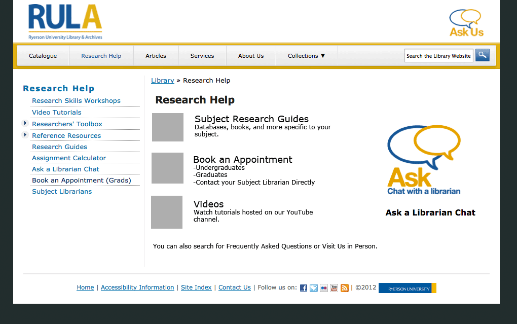
In the past month or so, it became very evident to many of the librarians that the research help page on our site needed to be revamped. As we’ll be piloting a new “Book a Librarian” service next month, I thought it would be a good time to roll out a new help page as well.
Old Research Help Page
There were so many problems with this page, not least of which was that the page and the sidebar had the exact same links only in a different order.
We had a bit of a tight timeline, since I essentially had 3-4 weeks to make mockups, discuss it with the group, get feedback from staff and students, make the page, and get it live.
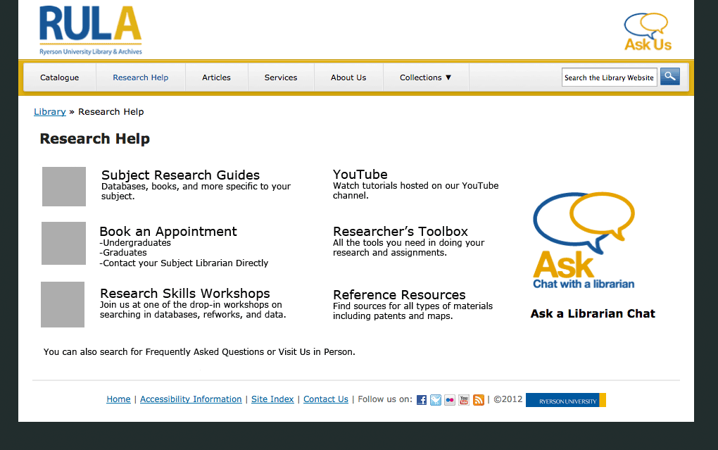
Mockup #1
Mockup #2
Mockup #3
Getting Quick Feedback
Part 1: The “Committee”
It wasn’t a formal committee, but it was essentially an ad hoc working group. I presented all three mockups to the group. If the group couldn’t agree on one, then I would have taken two of the mockups to staff and students for feedback. However, since the group felt quite strongly about mockup #3, I decided to go ahead with that mockup to gather feedback.
Part 2: Asking the Students – Survey
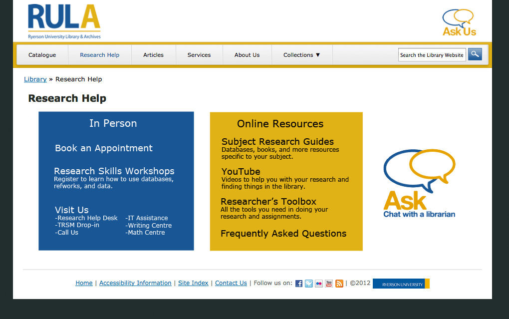
I decided to do two versions of the mockup based on the meeting’s discussions. Mockup #4 is exactly the same as mockup #3 except with the chat widget in the middle.
Mockup #4
We taped the mockups on a movable whiteboard and offered candy as incentive. We pulled students aside as they walked past on the main floor and asked them some basic questions on:
how easy it is to find what they’re looking for,
whether they understood all the terms, and
which design they preferred and why.
We had decided on getting however many students we could in an hour. Since it was a quieter day, we ended up with 7 students.
Part 3: Asking the Staff – Open “Silent Forum”
In order for all staff to have a chance to provide feedback, without having to gather them all together, we decided to post the mockups in the staff room with a couple of questions to think about (similar to the student ones). Sticky note pads and a pen were left for staff to write their comments.
The Results
Of the students we asked, more of them preferred #3 with the chat on the side, because they would never use it. On the other hand, the students who preferred #4 thought the right-side chat widget would be ignored or even mistaken as an ad. Other reasons for #4 included:
balanced and symmetrical
more aesthetically pleasing
better division of groupings
helps to promote the Ask chat service
Of the staff that provided feedback, they unanimously chose #4 for many of the same reasons that students provided.
Other feedback resulted in my adding:
a header for the chat widget,
“Hours & privacy policy” link for chat widget,
hover behaviour for chat widget,
tooltip text for “TRSM”, and
changing the wording of “YouTube” to avoid branding.
While we could’ve gotten more feedback, I think we got enough to help improve the page and implicit confirmation that it works.
New Research Help Page
Launch
The page, along with the new “Book a Librarian” service and a revised “Research Help Services” page is set to go live on Oct 1.
We will likely also be changing the “Ask Us” logo in the header to direct to this page as opposed to the “Contact Us” page as it does now. Hopefully, it’ll help to promote our services and resources, and get people to the right place.
We’ve recently had to put up a couple of announcements due to some patches and upgrades on our library website server. Right now, I’m doing it the way I’ve seen it done on most library websites and that’s to simply put up an announcement on the front page.
However, there are numerous downsides to this method.
First, the way I’ve done it, it only shows on the home page, and no other page.
Second, you have to visit the website beforehand while the announcement is up in order to know that the site will be down later.
Using the Blog
One way to get around the second problem at least, is to use the blog. Posting on the blog automatically pushes the downtime announcements to the homepage feed, meaning that anything following the feed will see the notice even without visiting the site. On our blog, we can also automatically push to Twitter and Facebook if we choose to do so.
On the other hand, it’s very much time sensitive, and if the person doesn’t visit the site during the early hours of the morning, they wouldn’t even notice. Is it something people really need to be notified off-site? If someone visits often enough, they’ll see it.
Notification Bar
To fix the first problem though, I have been pondering the use of a notification bar. Much like the ones you see when your JavaScript or Cookies are disabled (see the stackoverflow example below).
Of course, best practices seem to be to only use notification bars for browser related issues.
Pop Up
What might work better is to have a in-page popup on first visit (once the announcement is set), with the option to dismiss it. Using cookies, you could then locally store a simple variable to see whether the person has dismissed that particular announcement already.
Ideally, we could do it in such a way that it will work across the entire domain rather than just the one site.
I really appreciate a number of things, many of which are in other reviews and even in his introduction. Nevertheless, for the benefit of my readers, here’s what I like.
It’s short.
It’s easy to understand.
It’s concise and boils it down to a few simple guidelines.
There’s humour in it.
I will say that while most of the ideas and concepts still hold, there are some ideas presented that I think may be a little outdated. It could be that as someone who works with websites on a daily basis that some things seem obvious to me, but may not be “common” knowledge to others. Still, I think it’s easy enough to skip some sections if you feel you already know about it (as I did), and while some parts could be updated, the guidelines and concepts still hold true.
My Notes
I decided to take some notes for myself since I borrowed the book. If these notes pique your interest in any way, I suggest reading the book, because my notes are just that, notes, and in no way do the book justice.
Rule 1: Don’t Make Me Think
This translates to Eliminating Question Marks.
For example, When searching: What is a keyword? If you say it searches all or everything, then that’s what it should do.
Users should know without thinking:
Location within the site
What’s important
Where things are
Where to go
Why labelled that way
You can’t make everything self-evident, but you can make it self-explanatory.
People Scan and Click the First Reasonable Option
I don’t think this a surprise to people anymore, but it still holds true. The suggestion is to cut your text in half and then half again. Omit any unnecessary words.
Happy talk must die.
Cut down instructions as much as possible; make it self-explanatory instead.
The benefits:
Reduces noise
Useful content more prominent
Shorter pages
Design Pages for Scanning
create a visual hierarchy
take advantage of conventions
break pages into clearly defined areas
make the clickable obvious
minimize noise
People Like Mindless Choices
User should have confidence that they are on the right track. There’s still a limit to the number of clicks a used is willing to go through, but no hard number if they are mindless and not repetitive. Good example is buying for home office and needing to choose home or office.
Navigation
Should be persistent and consistent with the possible exception of the home and forms.
Links should match the page title. This may seem very obvious, but I see this discrepancy quite often.
On any page, you should be able to identify these basic elements:
Site
Page name
Major sections of the site
Local nav
Location within the site
How to search
Home Page
Should be able to answer these questions at a glance:
What site is this?
What do they have?
What can I do here?
Why should I be here and not somewhere else?
Where do I start?
Test Early and Test Often
Not the same as focus groups, which are good for determining the audience, if ideas and wording make sense, and their feelings.
[Usability tests are] for learning whether your site works and how to improve it.
Ideally, one morning a month for testing and then debrief over lunch.