Getting Quick Feedback: Updating the Help Page

In the past month or so, it became very evident to many of the librarians that the research help page on our site needed to be revamped. As we’ll be piloting a new “Book a Librarian” service next month, I thought it would be a good time to roll out a new help page as well.

Old Research Help Page

There were so many problems with this page, not least of which was that the page and the sidebar had the exact same links only in a different order.

We had a bit of a tight timeline, since I essentially had 3-4 weeks to make mockups, discuss it with the group, get feedback from staff and students, make the page, and get it live.

Getting Quick Feedback

Part 1: The “Committee”

It wasn’t a formal committee, but it was essentially an ad hoc working group. I presented all three mockups to the group. If the group couldn’t agree on one, then I would have taken two of the mockups to staff and students for feedback. However, since the group felt quite strongly about mockup #3, I decided to go ahead with that mockup to gather feedback.

Part 2: Asking the Students – Survey

I decided to do two versions of the mockup based on the meeting’s discussions. Mockup #4 is exactly the same as mockup #3 except with the chat widget in the middle.

Mockup #4

We taped the mockups on a movable whiteboard and offered candy as incentive. We pulled students aside as they walked past on the main floor and asked them some basic questions on:

  • how easy it is to find what they’re looking for,
  • whether they understood all the terms, and
  • which design they preferred and why.

We had decided on getting however many students we could in an hour. Since it was a quieter day, we ended up with 7 students.

Part 3: Asking the Staff – Open “Silent Forum”

In order for all staff to have a chance to provide feedback, without having to gather them all together, we decided to post the mockups in the staff room with a couple of questions to think about (similar to the student ones). Sticky note pads and a pen were left for staff to write their comments.

The Results

Of the students we asked, more of them preferred #3 with the chat on the side, because they would never use it. On the other hand, the students who preferred #4 thought the right-side chat widget would be ignored or even mistaken as an ad. Other reasons for #4 included:

  • balanced and symmetrical
  • more aesthetically pleasing
  • better division of groupings
  • helps to promote the Ask chat service

Of the staff that provided feedback, they unanimously chose #4 for many of the same reasons that students provided.

Other feedback resulted in my adding:

  • a header for the chat widget,
  • “Hours & privacy policy” link for chat widget,
  • hover behaviour for chat widget,
  • tooltip text for “TRSM”, and
  • changing the wording of “YouTube” to avoid branding.

While we could’ve gotten more feedback, I think we got enough to help improve the page and implicit confirmation that it works.

New Research Help Page

Launch

The page, along with the new “Book a Librarian” service and a revised “Research Help Services” page is set to go live on Oct 1.

We will likely also be changing the “Ask Us” logo in the header to direct to this page as opposed to the “Contact Us” page as it does now. Hopefully, it’ll help to promote our services and resources, and get people to the right place.

About Portal

So the About portal really was just a redesign for the most part. The process was the usual inventory of pages of the current About section (see below left), trying to put them into cateogries, then coming up with a preliminary information architecture. For this portal, we also consulted with the Communications department to ask about what else might be added.

Attempt #1
The first attempt at the redesign was to use the existing design from the Help and Services portals (see above right). If you look at the full version, you can tell that the problem with using the existing design is that there is a lot of white space since each category only has 2-4 links. Everyone, who looked at this first attempt, agreed that it just didn’t work. We concluded though that since the About portal didn’t serve the same sort of purpose as Help, Services, and Find, it would be okay to use a different design. So, it was back to the drawing board.

Attempt #2
When thinking about how we might do another design, one of the ideas was to somehow bring the University Librarian’s message back to the foreground. We essentially ended up with the layout of the old design, just with the set of links organized in the new way. This didn’t work either since the navigation of the portal was essentially lost.

Attempt #3
Finally, I thought perhaps we could go with a simpler design. I looked at a bunch of other sites (library and otherwise) to see how they dealt with the layout and organization of their About sections. Based on those layouts and suggestions from others, we came up with the current design.

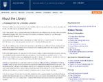
screenshot of current about
New About

The new About design uses the same organization as in the first version, but simply lays out all the links underneath a heading. It also has the first two paragraphs of the university librarian’s message, where if you click on the title, you will see the full message. We agreed that this was a nice balance between the first and second attempts.

Contact Us page
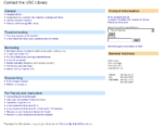
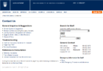
Most pages/posts were simply moved over, but all were in agreement that the Contact Us page needed a redesign. So, a redesign it was. We felt that the old page had too many links (all users who saw this page during the usability test said as much), especially since a lot of these links exist elsewhere on the site (namely on the Services Portal) and the front page as well in many cases. A couple of the forms were merged or updated to par down the number of links further.

Status
Migration of all the pages have been done and everything has been setup, but since the Newsletters were moved into Issuu, issues were embedded to posts (which worked fine), but then didn’t show up on aggregated pages (the embedded object would just be stripped out). Styling has yet to be done as well. Hopefully it’ll be live soon though.

The Ever Changing Project and Timeline

The Original Project
Not many people know, but when I began my current project/job, I was hired to revamp the Instructional Resources pages of the library website. Essentially, it was two pages. That’s right, two.

The Growing Project
Of course, trying to compile a list of all the instructional resources at such a large university still took a long time. And since part of the goal was to centralize these tutorials into one place and also migrate them to wiki, a whole web portal came out of it, which of course involved various staff and committees. The idea was to get it all done by the end of summer, but of course, because the tutorials also needed updating, that didn’t happen. To date, we have not migrated even half of the Help portal (of the list you see under Finding, only Journal Articles comes from the wiki). Nevertheless, we launched the portal page itself.

Redesigned Help Portal
Current Help Portal

The New (Related) Project
Out of my work on the one portal grew the plan for another portal, the purpose of which was to list the services the library provide. Our library has apparently never had such a page, which seemed odd to me, but true (I had never known of a page like that in all my time here).

Interestingly, this portal had much more user testing than consultation with others, because it was putting together a new portal and would not affect any existing parts of the website. We also rethought the design so that we minimize the amount of screen space we’d be using and in our testing, we found people had no problems with the navigation and those who tended to skim through pages found this design better/more useful than the older Help portal design, because they were forced to read the headings to move further on, and thus were more likely to read them than to skim.

Services Portal screenshot
Current Services Portal

Although some pages have yet to be migrated into WordPress/wiki, most of it is done even if it’s not all public. We prefer not to change things so close to the end of term (especially since some of them are really popular pages) and there’s a bug or two that need to be fixed with the WordPress pages. Soon though, I hope.

Two More Projects
So with Services launched, the plan for this term was basically the rest of the main site minus the home page (and Branches since that only really needs a migration). One is the Find Portal to replace the current navigation of Catalogues/Journals/E-Resources, and the other is About Portal to replace the current About Us section.

Ever Changing Timeline
It became fairly clear a few weeks ago that due to the need to prioritize other projects, my co-worker was not going to be available to do usability testing for the two new portals. After discussions with my supervisor, we decided that we’d have to push the timeline back for testing and we could really only go as far as preparing for it. Nevertheless, we’ll be pushing forward with About since that’s an area that is not used quite so much by our users and most of the decisions would come from other divisions. Find will go as far as a prototype site with preparation for usability testing.

Find Portal prototype screenshot
Find Portal prototype

Unfortunately, I struggled with the organization of the Find Portal, so another look will be needed before and after usability testing.

Here’s hoping that the new timeline goes through.

Ever Continuing Projects
So, beyond launching the actual portal pages, a lot of work has continued with migrating everything to WordPress and encourage staff to help update existing pages or provide us with new content. As I mentioned, much of Help is still simply linking to old pages (some were so out of date, we had to take them down), but Services is moving along and I hope to get it all done by the end of next month. Nevertheless, as all websites, it’ll be continual project that will be taken up by the rest of the team (and perhaps a new co-op student in the summer).

Launch of Help

So with the launch of help today, it will mean a redesigned section of the website. The key things we were going for:

  • clean & easy to read
  • consistent look & feel
  • standardizing some of the content
  • organization that makes sense to users
  • providing a design that gives a primary, secondary, and tertiary focus

This was the original main page, which was just a bunch of links which were not very well organized after the years of simply adding things compared to the new main page.

We took out the “Ask Us” from the main navigation bar and put it in a site wide side button, which many new sites are doing with feedback buttons. We also took out a mouse over menu from the main navigation bar that was a user guide type of page depending on the patron’s role (“Services for You”).

We moved those onto the Help page as well and linked to new versions with more or less the same content, but with some of it standardized and with a common look and tab navigation.

I like it and thinks it looks way better than before. Plus I think it’ll help our users find stuff!

EDIT: We received a lot of positive feedback! Yay!