Getting Quick Feedback: Updating the Help Page

In the past month or so, it became very evident to many of the librarians that the research help page on our site needed to be revamped. As we’ll be piloting a new “Book a Librarian” service next month, I thought it would be a good time to roll out a new help page as well.

Old Research Help Page

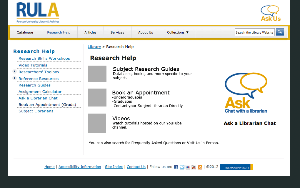
There were so many problems with this page, not least of which was that the page and the sidebar had the exact same links only in a different order.

We had a bit of a tight timeline, since I essentially had 3-4 weeks to make mockups, discuss it with the group, get feedback from staff and students, make the page, and get it live.

Getting Quick Feedback

Part 1: The “Committee”

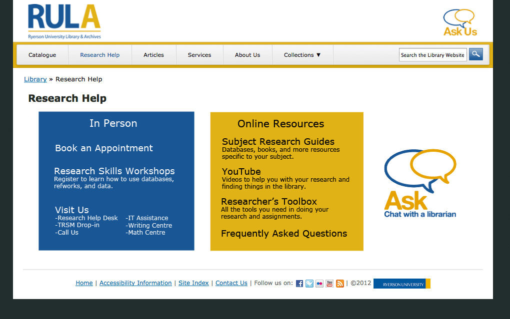
It wasn’t a formal committee, but it was essentially an ad hoc working group. I presented all three mockups to the group. If the group couldn’t agree on one, then I would have taken two of the mockups to staff and students for feedback. However, since the group felt quite strongly about mockup #3, I decided to go ahead with that mockup to gather feedback.

Part 2: Asking the Students – Survey

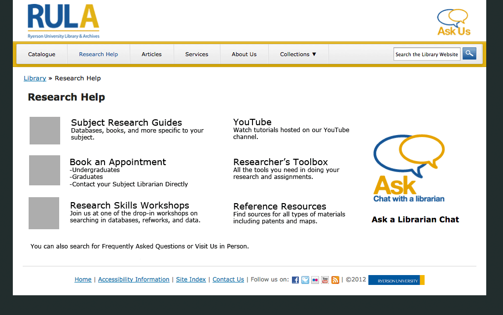
I decided to do two versions of the mockup based on the meeting’s discussions. Mockup #4 is exactly the same as mockup #3 except with the chat widget in the middle.

Mockup #4

We taped the mockups on a movable whiteboard and offered candy as incentive. We pulled students aside as they walked past on the main floor and asked them some basic questions on:

  • how easy it is to find what they’re looking for,
  • whether they understood all the terms, and
  • which design they preferred and why.

We had decided on getting however many students we could in an hour. Since it was a quieter day, we ended up with 7 students.

Part 3: Asking the Staff – Open “Silent Forum”

In order for all staff to have a chance to provide feedback, without having to gather them all together, we decided to post the mockups in the staff room with a couple of questions to think about (similar to the student ones). Sticky note pads and a pen were left for staff to write their comments.

The Results

Of the students we asked, more of them preferred #3 with the chat on the side, because they would never use it. On the other hand, the students who preferred #4 thought the right-side chat widget would be ignored or even mistaken as an ad. Other reasons for #4 included:

  • balanced and symmetrical
  • more aesthetically pleasing
  • better division of groupings
  • helps to promote the Ask chat service

Of the staff that provided feedback, they unanimously chose #4 for many of the same reasons that students provided.

Other feedback resulted in my adding:

  • a header for the chat widget,
  • “Hours & privacy policy” link for chat widget,
  • hover behaviour for chat widget,
  • tooltip text for “TRSM”, and
  • changing the wording of “YouTube” to avoid branding.

While we could’ve gotten more feedback, I think we got enough to help improve the page and implicit confirmation that it works.

New Research Help Page

Launch

The page, along with the new “Book a Librarian” service and a revised “Research Help Services” page is set to go live on Oct 1.

We will likely also be changing the “Ask Us” logo in the header to direct to this page as opposed to the “Contact Us” page as it does now. Hopefully, it’ll help to promote our services and resources, and get people to the right place.

Book Review & Notes: Don’t Make Me Think (Steve Krug)

I recently asked for some recommended resources and books to read on usability and UX (user experience). One that came highly recommended was Steve Krug‘s Don’t Make Me Think: A Common Sense Approach to Web Usability.

I really appreciate a number of things, many of which are in other reviews and even in his introduction. Nevertheless, for the benefit of my readers, here’s what I like.

  • It’s short.
  • It’s easy to understand.
  • It’s concise and boils it down to a few simple guidelines.
  • There’s humour in it.

I will say that while most of the ideas and concepts still hold, there are some ideas presented that I think may be a little outdated. It could be that as someone who works with websites on a daily basis that some things seem obvious to me, but may not be “common” knowledge to others. Still, I think it’s easy enough to skip some sections if you feel you already know about it (as I did), and while some parts could be updated, the guidelines and concepts still hold true.

My Notes

I decided to take some notes for myself since I borrowed the book. If these notes pique your interest in any way, I suggest reading the book, because my notes are just that, notes, and in no way do the book justice.

Rule 1: Don’t Make Me Think

This translates to Eliminating Question Marks.
For example, When searching: What is a keyword? If you say it searches all or everything, then that’s what it should do.

Users should know without thinking:

  • Location within the site
  • What’s important
  • Where things are
  • Where to go
  • Why labelled that way

You can’t make everything self-evident, but you can make it self-explanatory.

People Scan and Click the First Reasonable Option

I don’t think this a surprise to people anymore, but it still holds true. The suggestion is to cut your text in half and then half again. Omit any unnecessary words.

Happy talk must die.

Cut down instructions as much as possible; make it self-explanatory instead.

The benefits:

  • Reduces noise
  • Useful content more prominent
  • Shorter pages

Design Pages for Scanning

  • create a visual hierarchy
  • take advantage of conventions
  • break pages into clearly defined areas
  • make the clickable obvious
  • minimize noise

People Like Mindless Choices

User should have confidence that they are on the right track. There’s still a limit to the number of clicks a used is willing to go through, but no hard number if they are mindless and not repetitive. Good example is buying for home office and needing to choose home or office.

Navigation

Should be persistent and consistent with the possible exception of the home and forms.

Links should match the page title. This may seem very obvious, but I see this discrepancy quite often.

On any page, you should be able to identify these basic elements:

  • Site
  • Page name
  • Major sections of the site
  • Local nav
  • Location within the site
  • How to search

Home Page

Should be able to answer these questions at a glance:

  • What site is this?
  • What do they have?
  • What can I do here?
  • Why should I be here and not somewhere else?
  • Where do I start?

Test Early and Test Often

Not the same as focus groups, which are good for determining the audience, if ideas and wording make sense, and their feelings.

[Usability tests are] for learning whether your site works and how to improve it.

Ideally, one morning a month for testing and then debrief over lunch.

Keep and Refill Users’ Goodwill

Goodwill goes down when:

  • information is hidden
  • things are inflexible e.g. form fields
  • unnecessary information is requested
  • looks unprofessional

Goodwill goes up when you:

  • make things obvious
  • save steps
  • make it easy to recover from errors

Code4lib Day 3: Notes and Takeaways

You know, it’s hard to MC, follow twitter, pay attention, and blog, so as usual, only notes and takeaways for some of the presentations.

Full posts:

Your UI Can Make or Break the Application

  • software developers are creative
  • Prototyping: fail early and fail fast
  • user involvement: screenshots along with requirements
  • creates user buy-in
  • warning: don’t make demos look done!
  • don’t be afraid to “borrow” ideas
  • help the user be successful
    • stick with familiar designs
    • use simple language
    • keep labels/functionality consistent
    • give instant feedback
      • provide inline validation
      • some feedback through AJAX
  • Helpful Sites:
  • designmodo.com
  • thinkvitamin.com
  • ajaxload.info
  • uxdesign.smashingmagazine.com

Quick and Dirty Clean Usability: Rapid Prototyping with Bootstrap

by Shaun Ellis, Princeton University

Important to get user feedback, meaning to get things in front of them. Use drawings to keep people from getting bogged down by aesthetics.

Twitter released Bootstrap, an open source style guide that will put your feet in your shoes. It allows you to get really quick feedback on static images and interactive pieces, but will not make your site “instant delicious”.

Allows a lot of customization based on grid system.

Prototype yourself out of the cave.

Some References:

Wrap-Up

Some archive/relevant links:

Code4lib Day 2: How People Search the Library from a Single Search Box

by Cory Lown, North Carolina State University

While there is only one search box, typically there are multiple tabs, which is especially true of academic libraries.

  • 73% of searches from the home page start from the default tab
  • which was actually opposite of usability tests

Home grown federated search includes:

  • catalog
  • articles
  • journals
  • databases
  • best bets (60 hand crafted links based on most frequent queries e.g. Web of Science)
  • spelling suggestions
  • loaded links
  • FAQs
  • smart subjects

Show top 3-4 results with link to full interface.

Search Stats

From Fall 2010 and Spring 2011, ~739k searches 655k click-throughs

By section:

  • 7.8% best bets (sounds very little, but actually a lot for 60 links)
  • 41.5% articles, 35.2% books and media, 5.5% journals, ~10% everything else
  • 23% looking for other things, e.g. library website
  • for articles: 70% first 3 results, other 30% see all results
  • trends of catalogue use is fairly stable, but articles peaks at the end of term

How to you make use of these results?

Top search terms are fairly stable over time. You can make the top queries work well for people (~37k) by using the best bets.

Single/default search signals that our search tools will just work.

It’s important to consider what the default search box doesn’t do, and doubly important to rescue people when they hit that point.

Dynamic results drive traffic. When putting few actual results, the use of the catalogue for books went up a lot compared to suggesting to use the catalogue.

Collecting Data

Custom log is being used right now by tracking searches (timestamp, action, query, referrer URL) and tracking click-throughs. An alternative might be to use Google Analytics.

For more, see the slides below or read the C&RL Article Preprint.

Code4lib Day 1: Lightning Talks Notes

Al Cornish – XTF in 300 seconds (Slides in PDF)

  • technology developed and maintained by California Digital Library
  • supports the search/display of digital collections (images, PDFs, etc)
  • fully open source platform, based on Apache Lucene search toolkit
  • Java framework, runs in Tomcat or Jetty servlet engine
  • extensive customization possible through XSLT programming
  • user and developer group communication through Google Groups
  • search interface running on Solr with facets
  • can output in RSS
  • has a debug mode

Makoto Okamoto – saveMLAK (English)

  • Aid activities for the Great East Japan Earthquake through collaboration via wiki
  • input from museum, library, archive, kominkan = MLAK
  • 20,000 data of damaged area
  • Information about places, damages, and relief support
  • Key Lessons
    • build synergy with twitter
    • have offline meet ups & training

Andrew Nagy – Vendors Suck

  • vendors aren’t really that bad
  • used to think vendors suck, and that they don’t know how to solve libraries’ problems
  • but working for a vendor allows to make a greater impact on higher education, more so than from one university (he started to work for SerialsSolution)
  • libraries’ problems aren’t really that unique
  • together with the vendor, a difference can be made
  • call your vendors and talk to the product managers
  • if they blow you off, you’ve selected the wrong vendor
  • sometimes vendor solutions can provide a better fit

Andreas Orphanides – Heat maps

The library needed grad students to teach instructional sessions, but how to set schedule when classes have a very inflexible schedule? So, he used the data of 2 semesters of instructional sessions using date and start time, but there were inconsistent start times and duration. The question is how best to visualize the data.

  • heatmap package from clickheat
  • time of day – x-dimension
  • day of the week – y-dimension
  • could see patterns in way that you can’t in histogram or bar graph
  • heat map needn’t be spatial
  • heat maps can compare histogram-like data along a single dimension or scatter-like plot data to look for high density areas

Gabriel Farrell – ElasticSearch

Nettie Lagace from NISO

  • National Information Standards Organization (NISO)
  • work internationally
  • want to know: What environment or conditions are needed to identify and solve the problem of interoperability problems?

Eric Larson – Finding images in book page images

A lot of free books exist out there, but you can’t have the time to read them all. What if you just wanted to look at the images? Because a lot of books have great images.

He used curl to pull all those images out, then use imagemagick to manage the images. The processing steps:

  1. Convert to greyscale
  2. Contrast boost x8
  3. Covert image to 1px by height
  4. Sharpen image
  5. Heavy-handed grayscaling
  6. Convert to text
  7. Look for long continuous line of black to pull pages with images

Code is on github

Adam Wead – Blacklight at the Rock Hall

  • went live, soft launch about a month ago
  • broken down to the item level
  • find bugs he doesn’t know about for a beer!

Kelley McGrath – Finding Movies with FRBR & Facets

  • users are looking for movies, either particular movie or genre/topic
  • libraries describe publications e.g. date by DVD, not by movie
  • users care about versions e.g. Blu-Ray, language
  • Try the prototyped catalog
  • Hit list provides one result per movie, can filter by different facets

Bohyun Kim – Web Usability in terms of words

  • don’t over rely on the context
  • but context is still necessary for understanding e.g. “mobile” – means on the go, what they want on the go
  • sometimes there is no better term e.g. “Interlibrary Loan”
  • brevity will cost you “tour” vs. “online tour”
  • Time ran out, but check out the rest of the slides

Simon Spero – Restriction Classes, Bitches

OWL:

  • lets you define properties
  • control what the property can apply to
  • control the values the property can take
  • provides an easy way to do this
  • provides a really confusing way to do this

The easy way is usually wrong!

When defining what can apply to and the range, this applies to every use of the property. An alternative is Attempto.

Cynthia Ng – Processing & ProcessingJS

  • Processing: open source visual programming language
  • Processing.js: related project to make processing available through web browsers without plugins
  • While both tend to focus on data visualizations, digital art, and (in the case of PJS) games, there are educational oriented applications.
  • Examples:
    • Kanji Compositing – allows visual breakdown of Japanese kanji characters, interact with parts, and see children.
    • Primer on Bezier Curves – scroll down to see interactive (i.e. if you move points, replots on the fly) and animated graphs.
  • Obvious use might be instructional materials, but how might we apply it in this context? What other applications might we think of in the information organization world?

Since doing the presentation, I have already gotten one response by Dan Chudnov who did a quick re-rendering of newspaper data from OCR data. Still thinking on (best) use in libraries and other information organizations.

It’s over for today, but if you’d like more, do remember that there is a livestream and you can follow on twitter, #c4l12 or IRC.